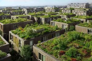

Walking through vibrant urban neighborhoods often makes us wonder how specific building facades instantly draw our eye while others completely fade away. Applied color theory in architectural design transforms raw steel, concrete, and glass into active psychological environments that dictate how we navigate cities.
Key Takeaways
- Color shapes spatial scale, building thermal efficiency, and human psychology across urban environments.
- The 60-30-10 palette framework prevents visual clutter while directing foot traffic and highlighting key structures.
- Strategic accent hues establish urban wayfinding, civic identity, and neighborhood cohesion.
- Historical palettes like Le Corbusier’s Polychromie Architecturale demonstrate how color alters physical form and volume.
- Combining material reflection with intentional color selection enhances bioclimatic building performance and urban livability.
Color Theory in Architectural Design Matters
Imagine living in a city painted entirely in drab hospital beige. What a total buzzkill! Understanding color theory in architectural design keeps our cities from looking like sad, depressing concrete blocks.
It is the secret sauce that turns ordinary buildings into thrilling urban landmarks, keeps your energy up, and secretly tricks your brain into feeling like a tiny room is actually a massive penthouse suite.
Foundations of Urban Color Perception
Architectural color is never just a surface finish applied at the end of a project. When applied across large-scale civic structures, chromatic choices manipulate visual weight, alter perceived volume, and fundamentally reconfigure how communities interact with built environments.
Visual Depth and Spatial Dynamics
Light tones reflect natural sunlight and make tight urban spaces feel expansive and open with use of brutalist architecture. Conversely, dark tones absorb light, recede into the background, and create intimate, cozy atmospheres in large municipal halls.
Carefully chosen ceiling hues dramatically alter spatial dimensions. A dark color visually lowers an uncomfortably high ceiling, while matching wall and ceiling tones raises the visual wall height to create an airy feeling.
Psychophysiological Responses to Built Environments
Colors spark physical reactions long before we consciously process an architectural space. Warm tones like red, orange, and yellow stimulate social energy and increase appetite in dining districts and vibrant public plazas.
Cool tones such as blue and green promote calm, focus, and healing in offices, hospitals, and quiet residential quarters. Meanwhile, constructive earth tones like ochre and sienna foster natural harmony and emotional warmth through raw material pairings.
Environmental Lighting and Surface Textures
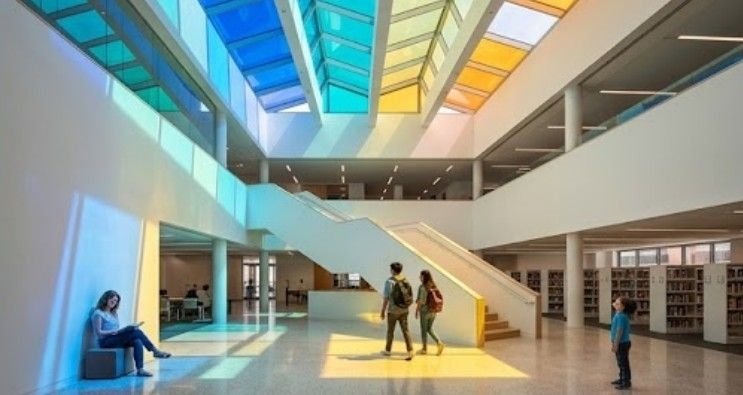
Natural light shifts continuously throughout the day as solar paths change. Warm morning light and cool afternoon daylight fundamentally alter how surface hues present to pedestrians across different seasons.
Material reflection also plays a massive role in exterior aesthetics. Unfinished textures like exposed wood, rough brick, or raw concrete cast secondary warm or cool tones onto adjacent painted structural surfaces.
Strategic Palette Selection in Modern City Architecture
Designing a city landmark requires balancing raw material textures with synthetic pigments to build distinct neighborhood identities and logical movement pathways.
Integrating the 60-30-10 Proportional Framework
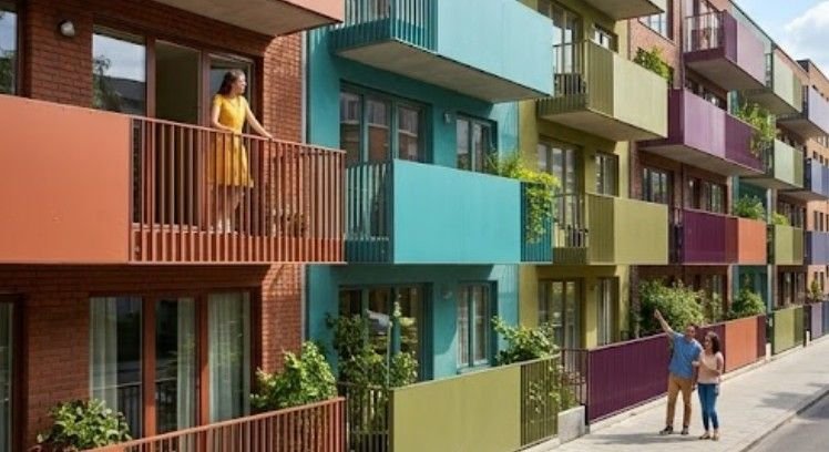
Mastering balance across massive facades relies on strict proportional distribution. Sixty percent of the structure consists of the dominant base material or hue, thirty percent features secondary framing elements, and ten percent uses vibrant focal accents to guide visitor movement.
Using this balanced approach ensures that public buildings stand out without visually overwhelming the surrounding streetscape. It creates a harmonious relationship between modern construction materials and existing historical architecture.
Leveraging the 3-Color Guideline for Balance
Limiting a building exterior to three primary color families prevents visual chaos in dense streetscapes. Anchor your structure with a foundational neutral, introduce a structural tone, and cap it off with a dynamic highlight to maintain clean architectural lines.
This three-color strategy creates clear visual cues for pedestrians approach from a distance. It simplifies complex facade geometry into easily digestible shapes and entry points.
Historic Influences on Architectural Color Theory
Modern civic planning owes much of its chromatic approach to early modernists who treated color as a primary building material alongside brick and mortar.
Le Corbusier’s Architectural Polychromy
Le Corbusier revolutionized spatial design by publishing his 1931 and 1959 color keyboards, known as Polychromie Architecturale. He proved that strategic color application could dynamically alter physical space, camouflage structural defects, and evoke specific emotional states across public projects.
His system organized pigments into harmonious palettes designed to interact perfectly with natural daylight. Architects still rely on these timeless palettes to bring psychological depth to modern structural concrete.
Structural Color Application Rules
Corbusier established that purism-derived natural pigments maintain spatial clarity, while saturated synthetic hues modify visual proportions. Using high-contrast accents allowed him to visually lift heavy concrete roofs and create weightless interior volumes.
These structural rules prevent bold colors from feeling like cheap superficial decoration. Instead, the hues feel like integral components of the building frame itself.
How to Apply Color Theory in Architectural Design Facades
Executing a successful color strategy across an urban facade requires a systematic, step-by-step workflow that pairs environmental analysis with technical testing.
First, conduct a thorough site survey to document local solar angles, climate patterns, and neighboring historical facades. This ensures your primary base color harmonizes with regional light conditions and urban context.
Second, select your sixty percent dominant hue using natural structural materials like masonry, exposed concrete, or bio-based paneling. This anchors the building within its immediate environment while setting the thermal absorption baseline.
Third, establish the thirty percent secondary palette across structural framing, window mullions, and balcony undersides. Choose complementary or low-contrast shades that add shadow depth without overwhelming the main structure.
Fourth, integrate your ten percent high-contrast accent exclusively at primary interaction zones like entry portals, wayfinding signage, and public seating areas. This functional application immediately signals circulation pathways to pedestrians.
Fifth, perform on-site mockups using large-scale physical samples under varying weather conditions. Observing pigment performance under direct midday sun and twilight rain prevents unexpected visual shifting before final construction.
Environmental and Bioclimatic Benefits of Surface Colors
Surface pigment selection plays a direct role in urban thermodynamics, building energy consumption, and long-term environmental sustainability.
Thermal Regulation and Solar Reflectance
Light-colored exterior finishes with high Solar Reflectance Index values bounce solar radiation back into the atmosphere. This reduces interior cooling loads and actively fights the urban heat island effect in dense metropolitan centers.
Dark exterior panels can be strategically placed in cooler climates to absorb passive solar warmth. This intentional thermal zoning significantly lowers winter heating demands for commercial properties.
Daylight Harvesting and Interior Luminance
Selecting high-reflectance interior finishes allows natural light to bounce deeper into interior floor plates. High-value ceilings and perimeter walls reduce reliance on artificial lighting, cutting operational energy costs significantly.
Maximizing natural daylight harvesting improves occupant wellness and productivity. It creates healthy, well-lit spaces while reducing the carbon footprint of high-density city developments.
Frequently Asked Questions
1. What is the color theory in architecture?
Color theory in architectural design is the strategic use of color palettes, spatial perception, and light interaction to define building environments, influence human mood, alter spatial dimensions, and accentuate structural forms.
2. What is the 70/20/10 rule for colors?
The 70/20/10 rule is a spatial palette distribution guideline where 70% represents the dominant background tone, 20% serves as the secondary structural color, and 10% provides a bold accent hue for visual interest.
3. What is the 3 color rule in design?
The 3 color rule limits a project palette to three core hues, including a primary neutral base, a secondary structural shade, and an accent color, ensuring visual harmony and preventing aesthetic clutter across facades.
4. What is Le Corbusier’s color theory?
Created in 1931 and 1959, his Polychromie Architecturale organized 63 master shades into dynamic palettes designed to alter spatial volume, impact human psychology, and define structural architectural form.
Painting the Town Right with Color Theory
Applying color theory in architectural design bridges the gap between raw structural engineering and human-centered urban environments. By mastering proportional frameworks, historical polychromy, and bioclimatic thermal balance, architects can transform city blocks into functional landmarks.
Plan your next project with intent, leverage smart material pigments, and watch your urban structures elevate the surrounding cityscape into a thriving masterpiece.